🃏🎴
Designing a visual system for a (large) deck of cards
Fall 2019
6 weeks
Visual Identity
Print Design
6 weeks
Visual Identity
Print Design
Develop a visual and typographic system for a deck of twenty unique 7” x 11” cards based on the question: What does design mean to you?
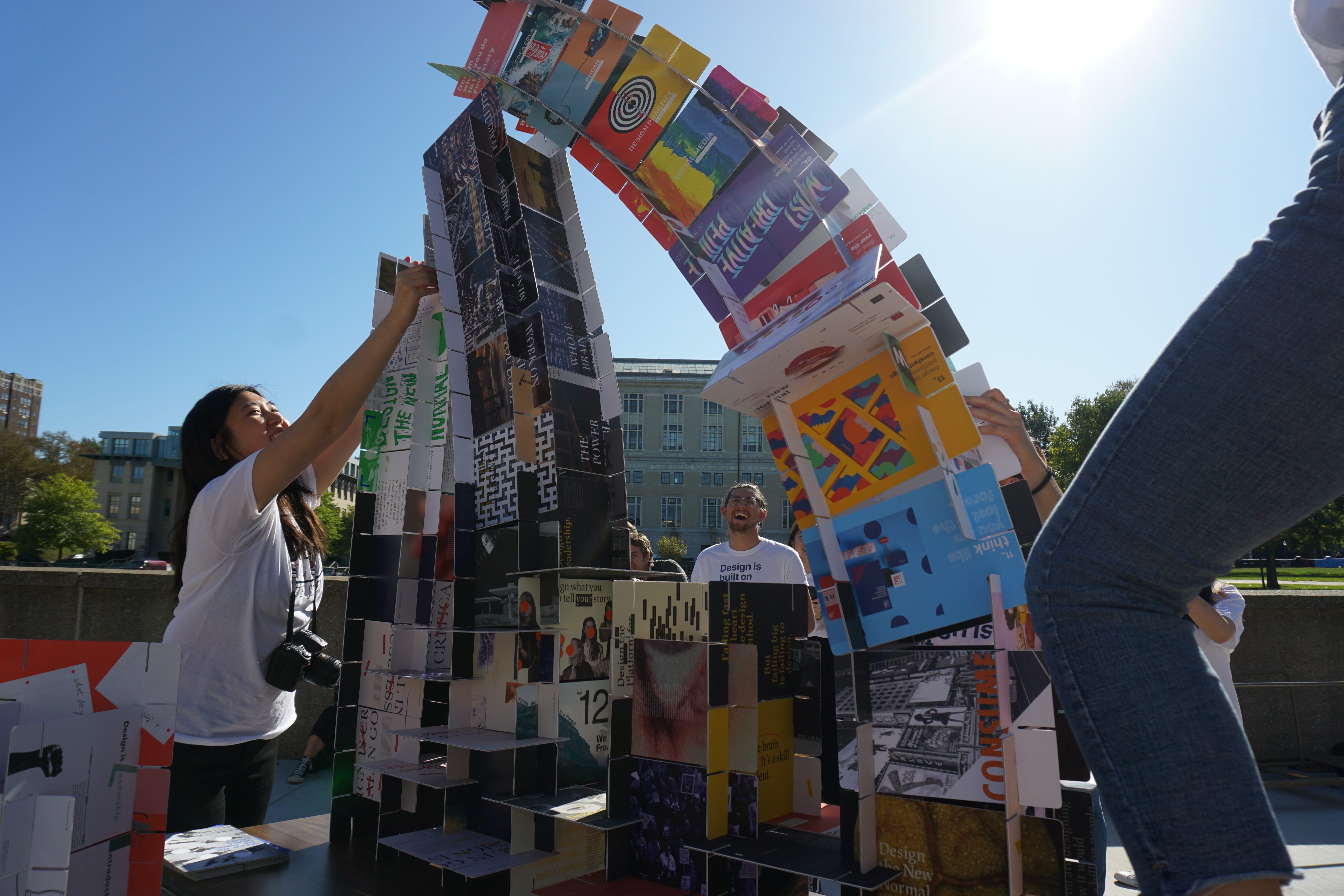
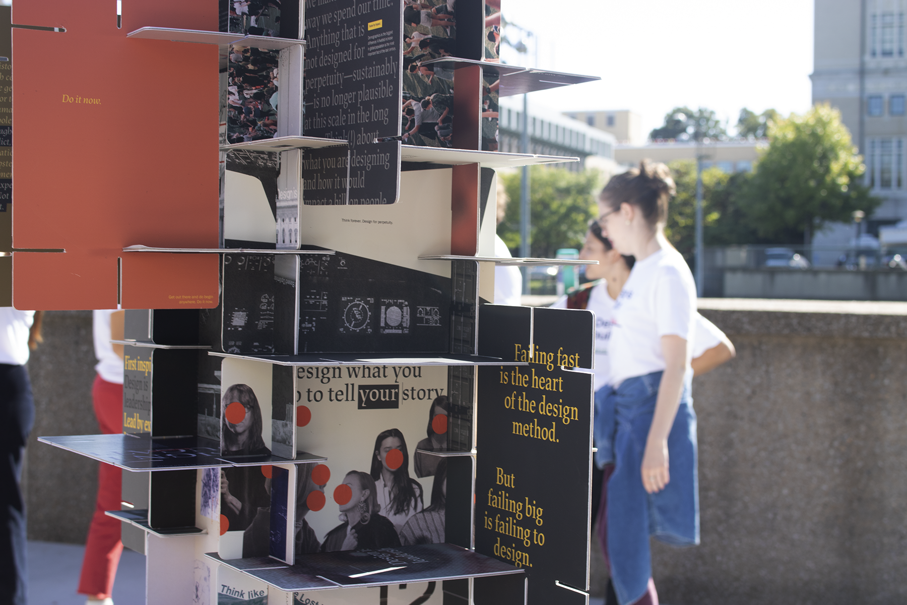
The cards can interlock with each other to construct a number of structures, but when combined with other card decks, can also create amazing architectural forms. As a class, we planned and promoted a pop-up build event to showcase our individual decks and invite other students to construct and deconstruct our house(s) of cards.
The cards can interlock with each other to construct a number of structures, but when combined with other card decks, can also create amazing architectural forms. As a class, we planned and promoted a pop-up build event to showcase our individual decks and invite other students to construct and deconstruct our house(s) of cards.
01. The Cards
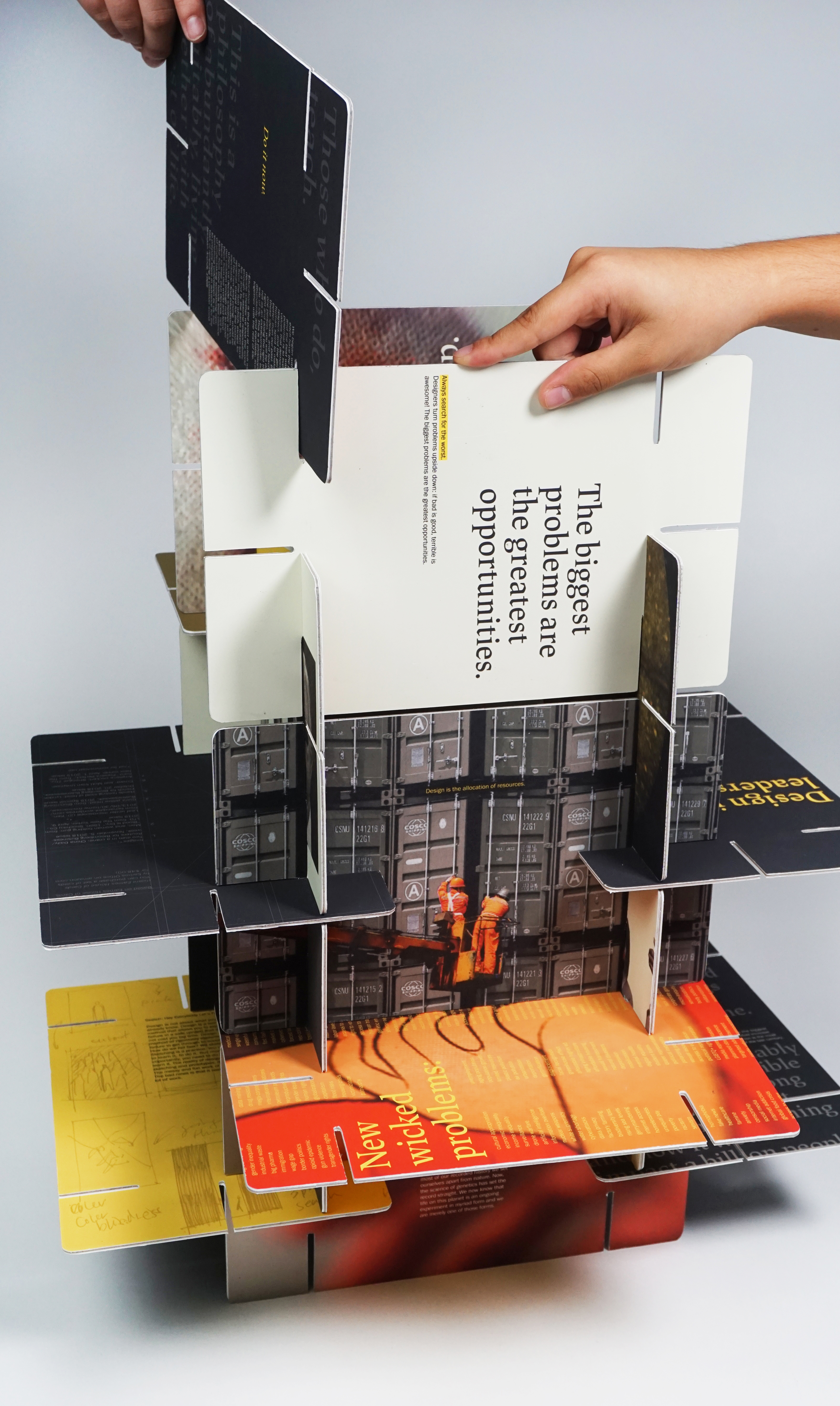
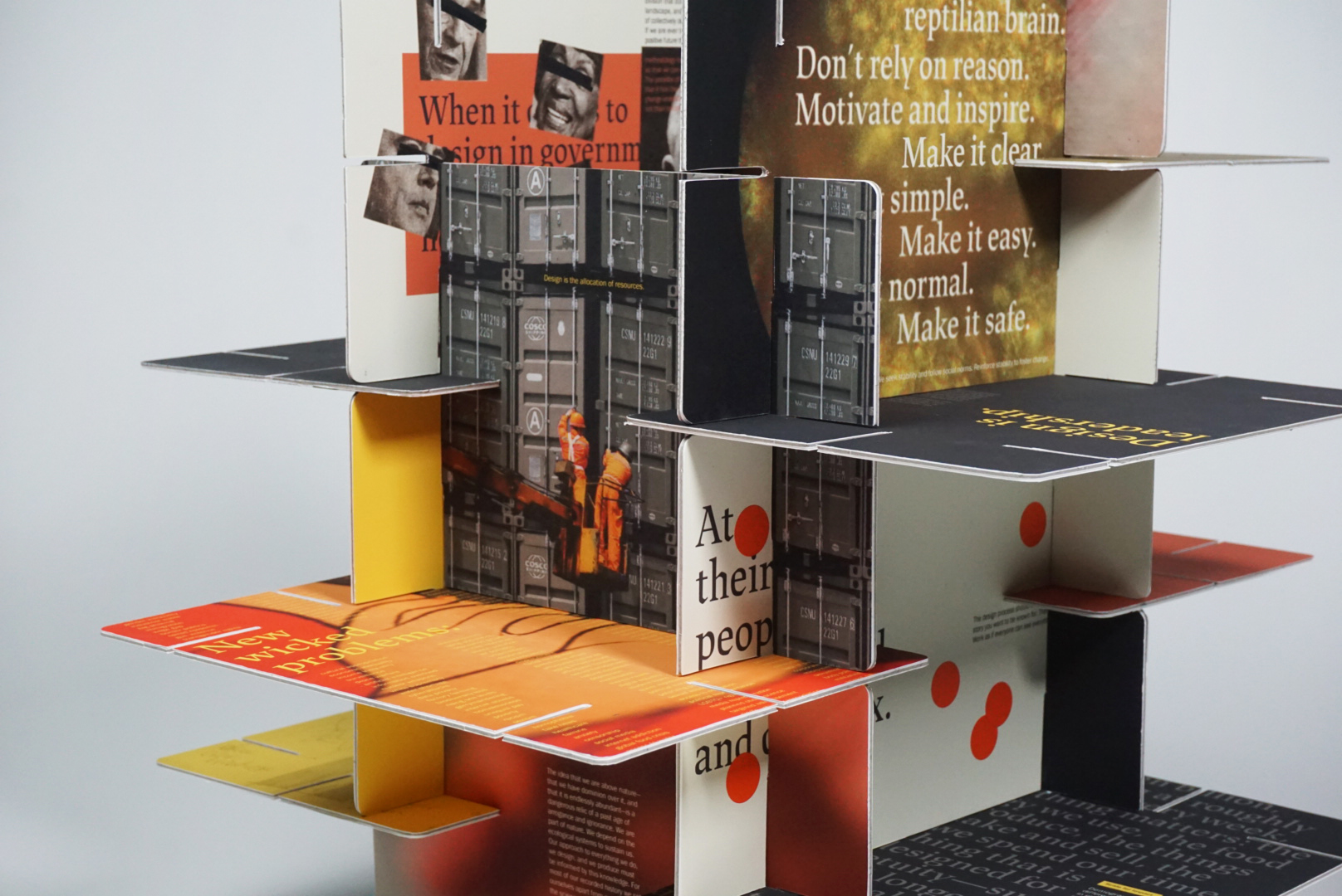

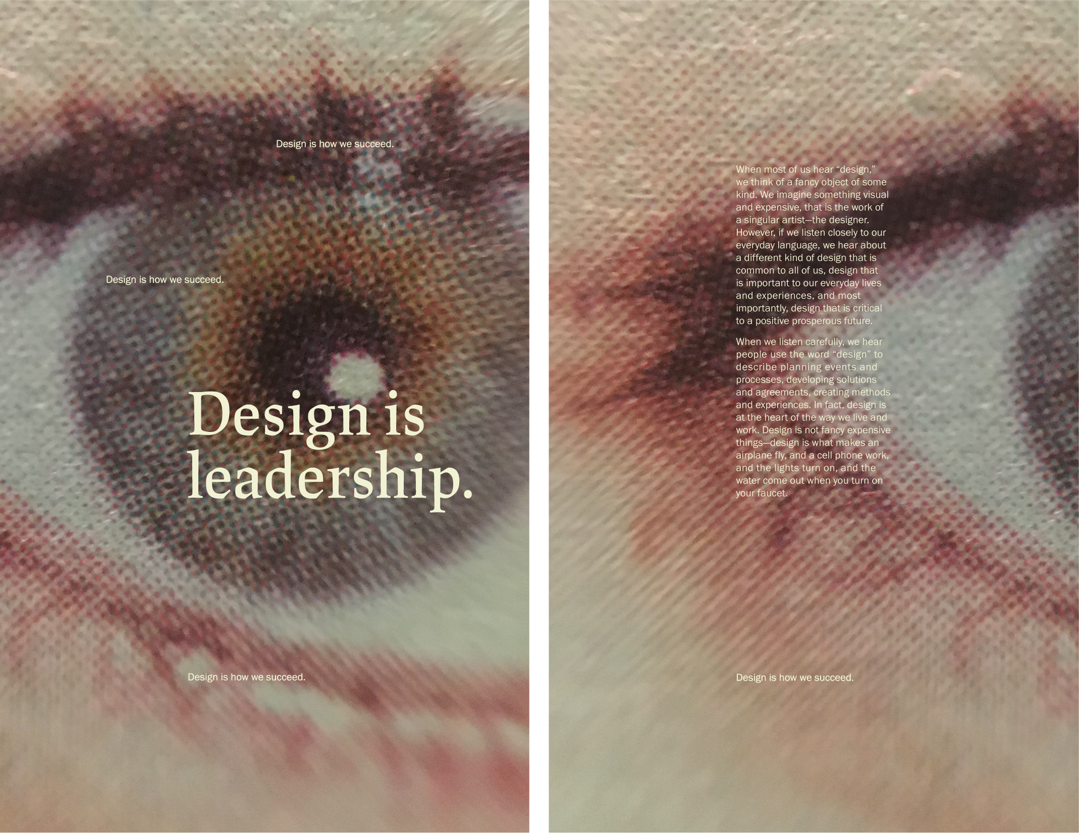


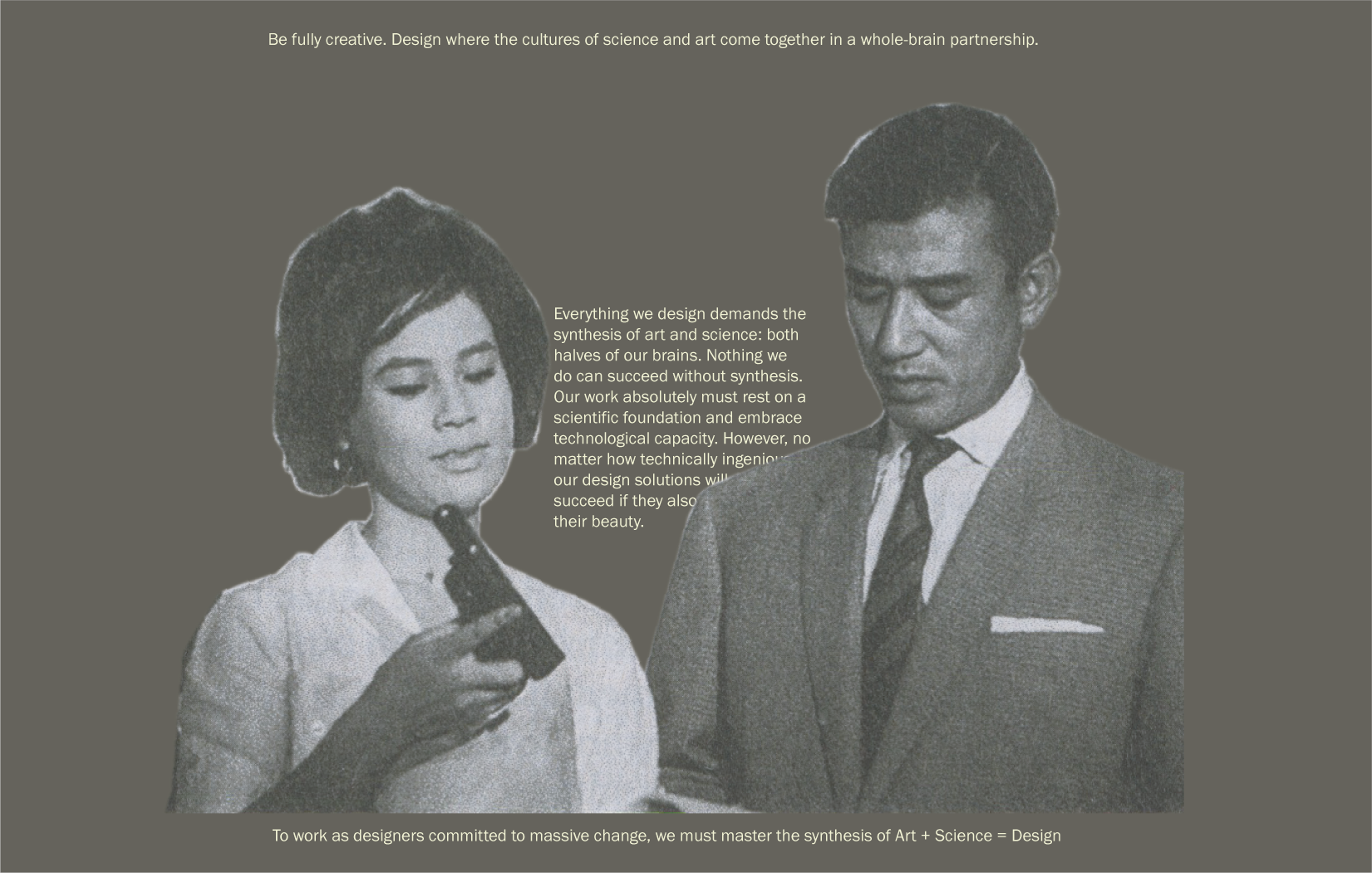
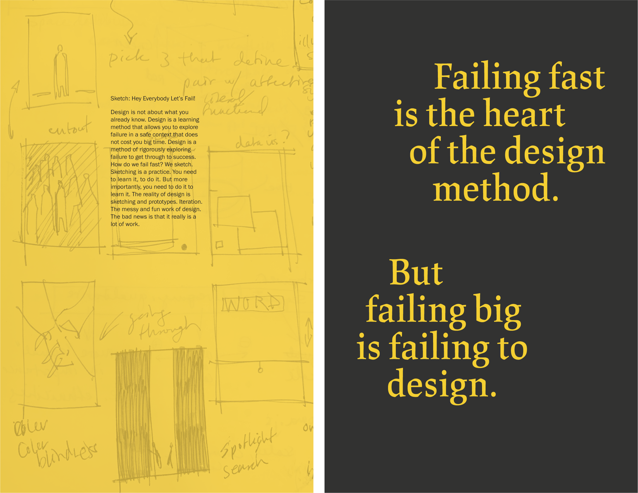

Concept
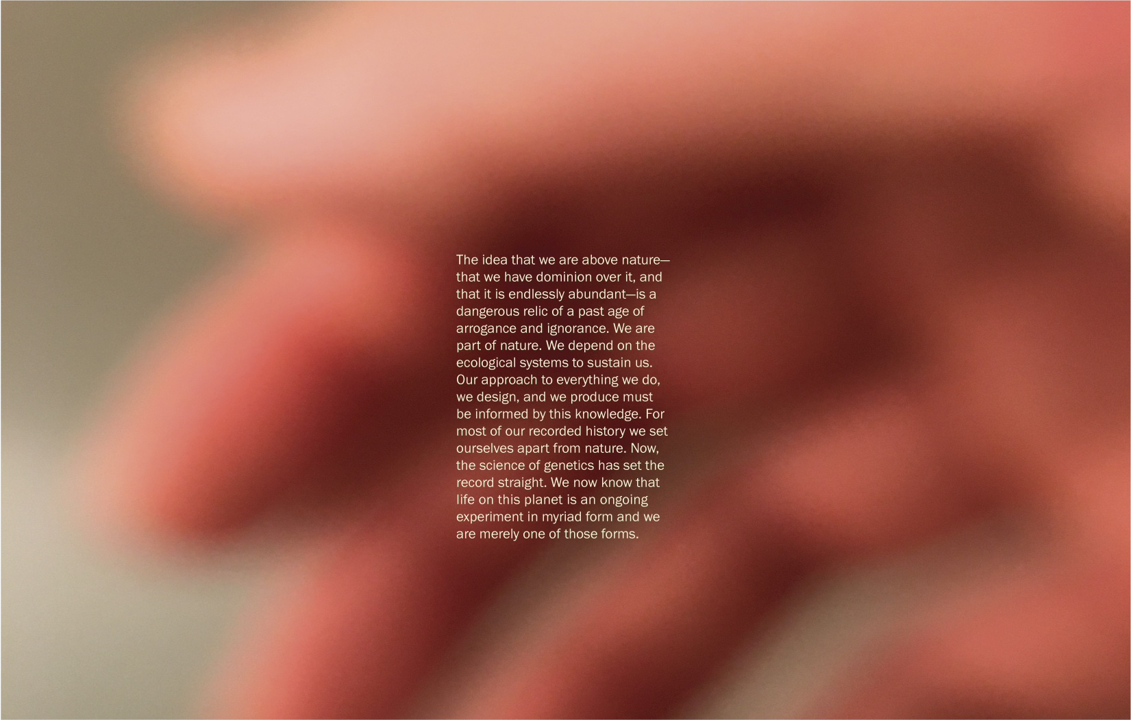
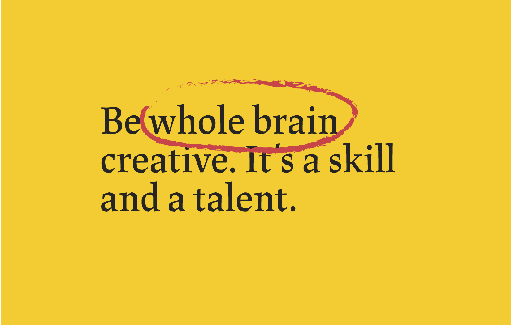
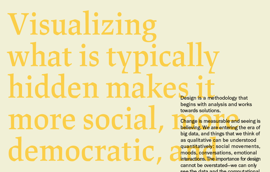
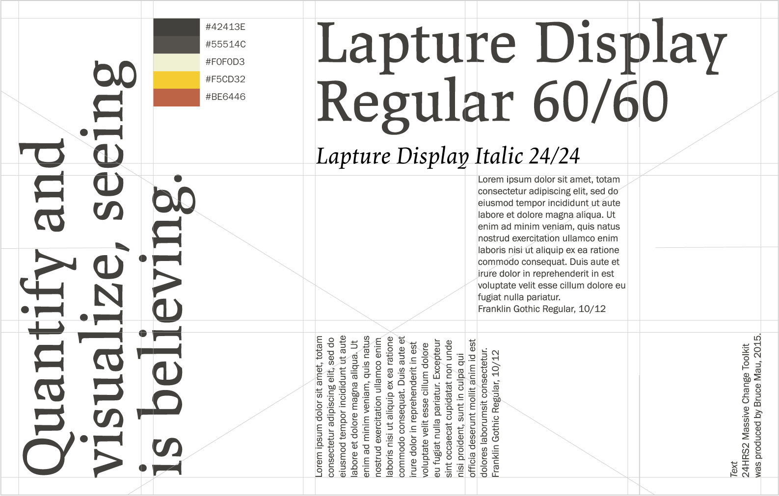
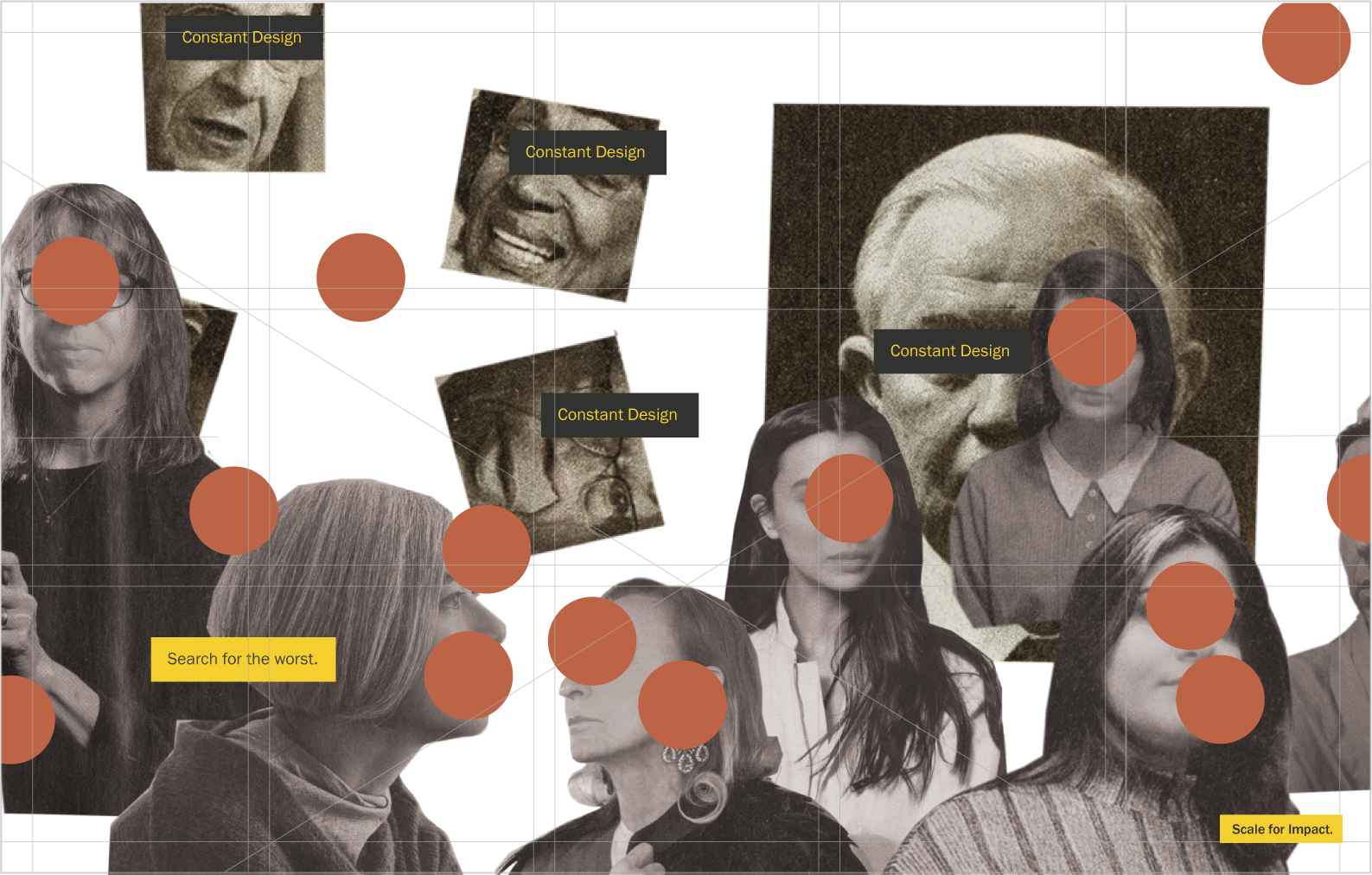
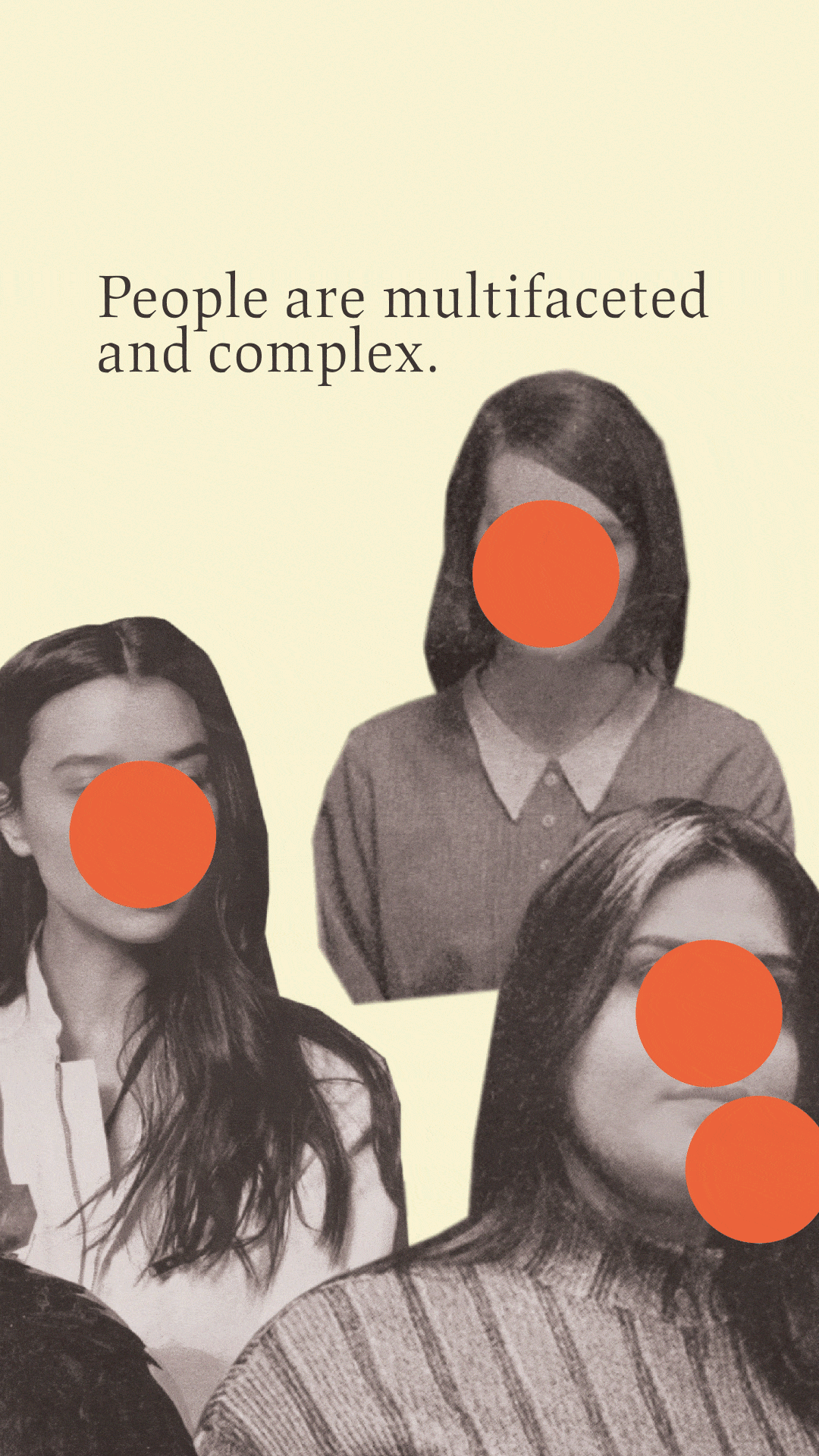
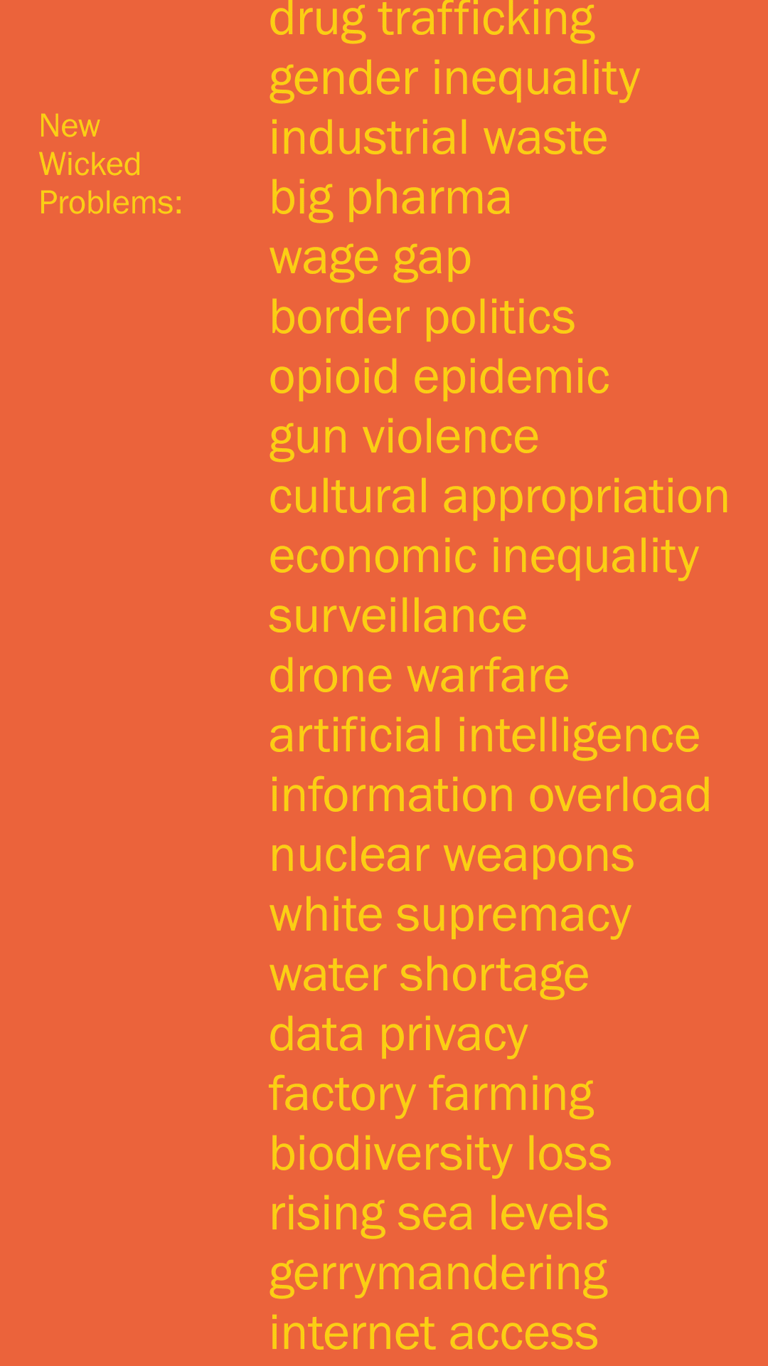
Using Bruce Mau’s 24HRS2 Massive Change Toolkit as content—a manifesto about the role of design in making systemic change—I designed a grid and type system that could be rotated 90°, for either a horizontal or vertical card design.
The design was driven by my critique of this manifesto. Who is being heard in the design conversation in the first place? I wanted to highlight this visibility, or lack of, with the deck of cards.
The design was driven by my critique of this manifesto. Who is being heard in the design conversation in the first place? I wanted to highlight this visibility, or lack of, with the deck of cards.
02. Social Media


Brand, Promotion
These animations were posted on my Instagram story over three days to promote the pop-up build event. Every Instagram story closed with the event name, date, time and place.
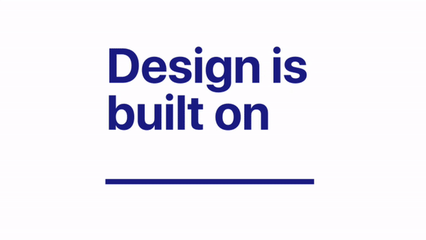
I worked with Jenni Lee and Jaclyn Saik to develop an identity for the event, titled: “Design is built on.” By making the title a prompt, every person could individualize their project while staying cohesive as a collective. The wordmark and branding reflects the class’ personality and individual concepts, as well as the playfulness that comes from building free-form, towering card structures.
I worked with Jenni Lee and Jaclyn Saik to develop an identity for the event, titled: “Design is built on.” By making the title a prompt, every person could individualize their project while staying cohesive as a collective. The wordmark and branding reflects the class’ personality and individual concepts, as well as the playfulness that comes from building free-form, towering card structures.
03. Pop-up Event: “Design is built on ➞”
![]()
![]()
![]()
![]()