✨ pt.1
What are designers actually worried about in the industry?
Spring 2020
6 weeks
Data Visualization
Web Design
Interaction Design
Team
Alice Fang
Rachel Lee
Jaclyn Saik
6 weeks
Data Visualization
Web Design
Interaction Design
Team
Alice Fang
Rachel Lee
Jaclyn Saik
Tracing connections between what designers are saying about intersectional issues
The AIGA Design Census is a comprehensive census of the design industry, and surveys quantitative data about salary, job satisfaction, future outlook. Hidden in the raw dataset were the responses to the question “What critical issues face design?,” where respondents could write-in their own answers.
The 2700+ written responses were insightful and expressive, personal in a way that the discrete data was not. We wanted to use this corpus to tell a story, and to humanize the data set—to see responses as people and not data points.
My roles on the project included analyzing the dataset (parsing text with python, categorizing and analyzing responses), and prototyping web interactions.
This project exists in two forms: an exploratory website, and an interactive book.

Creating a site to make users engage with all of the content of the dataset
The site was designed to be visually busy, with multiple layers of interaction with the data. We wanted users to ‘physically’ engage with the content, by being able to receive visual feedback from the words themselves.
A digital interface allows for quick transitions between content using hyperlinks. Moving through layers of meta information and cyclical clicking inspired our visual design and interactions.
I prototyped different iterations of content layout and web interactions, and organized the information architecture of the site, so that the team would remain on the same page as Rachel moved forward with web development. Jaclyn and I finalized the look and visual system.
Site Architecture
![]()

We used different web interactions to highlight + layer different information
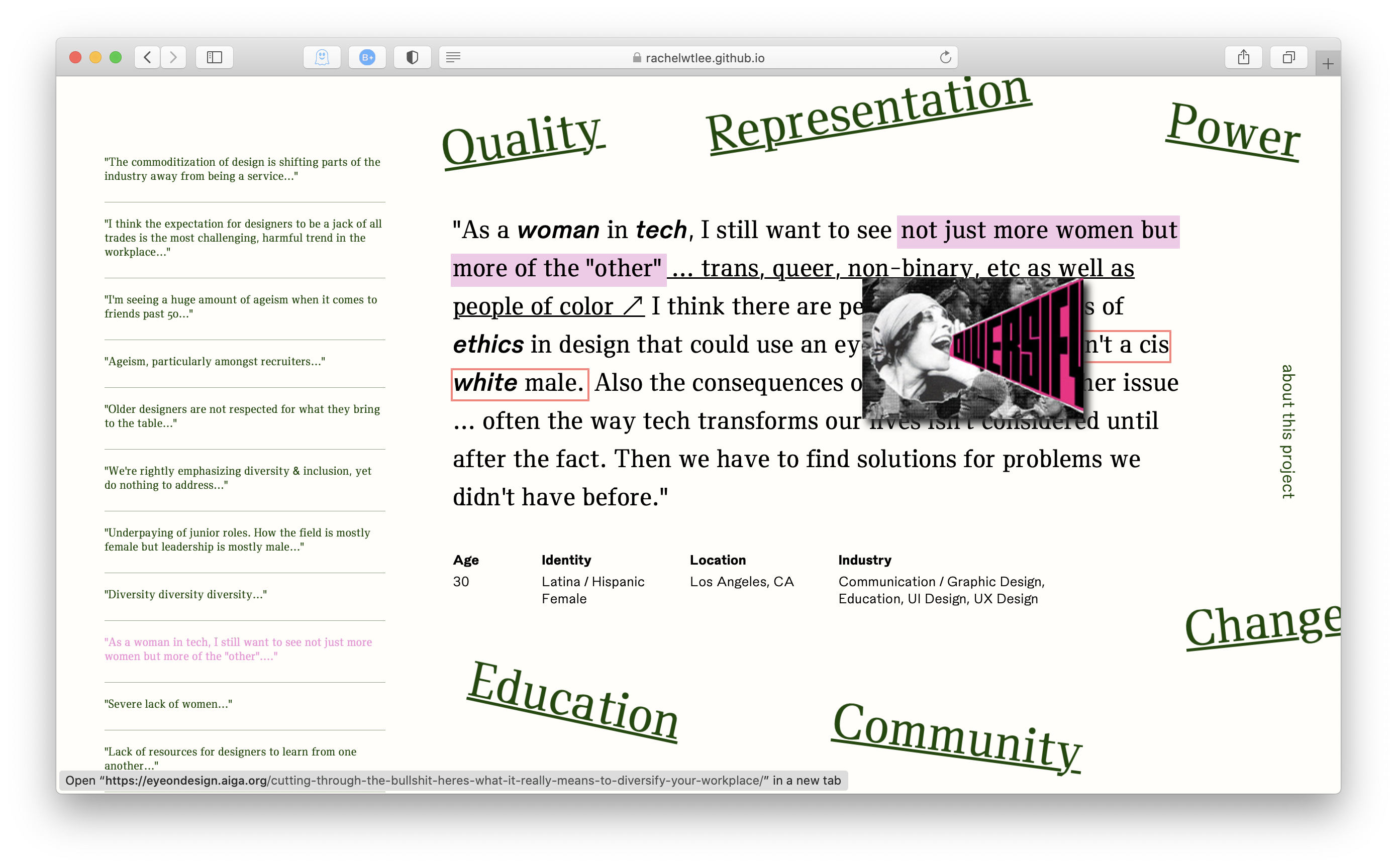
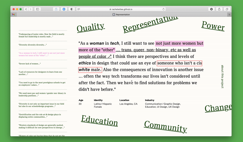
01. Theme Highlights
Each quote has highlights that relate back to the broader category. Hovering over the outline of a highlight connects the quote to a different category, representing intersections in response topics. This prompts users to either follow a theme through one category, or jump to a different topic entirely.
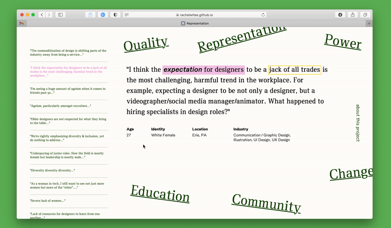
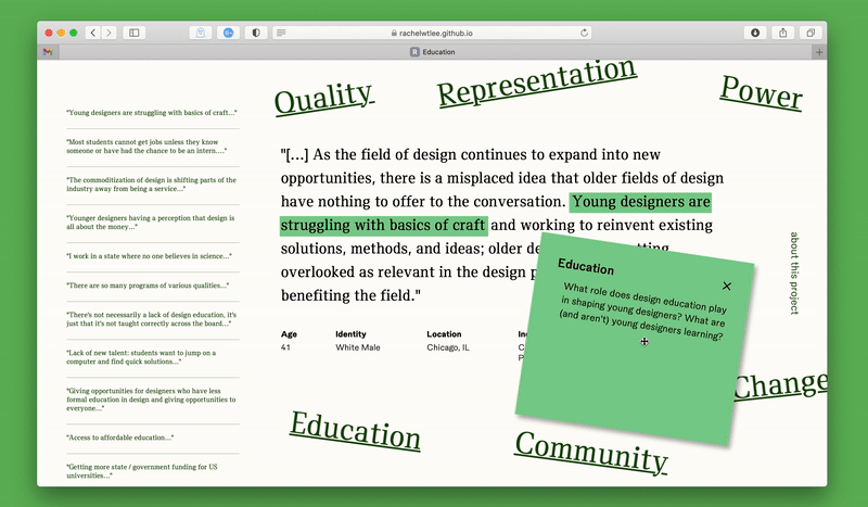
02. Quote Preview
The column on the left side provides previews of every quote within a category, and gives the user a way to mark their location and jump around, browsing based on interest.
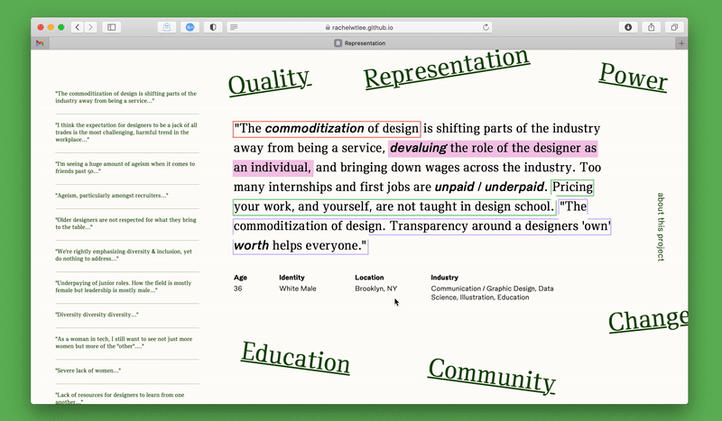
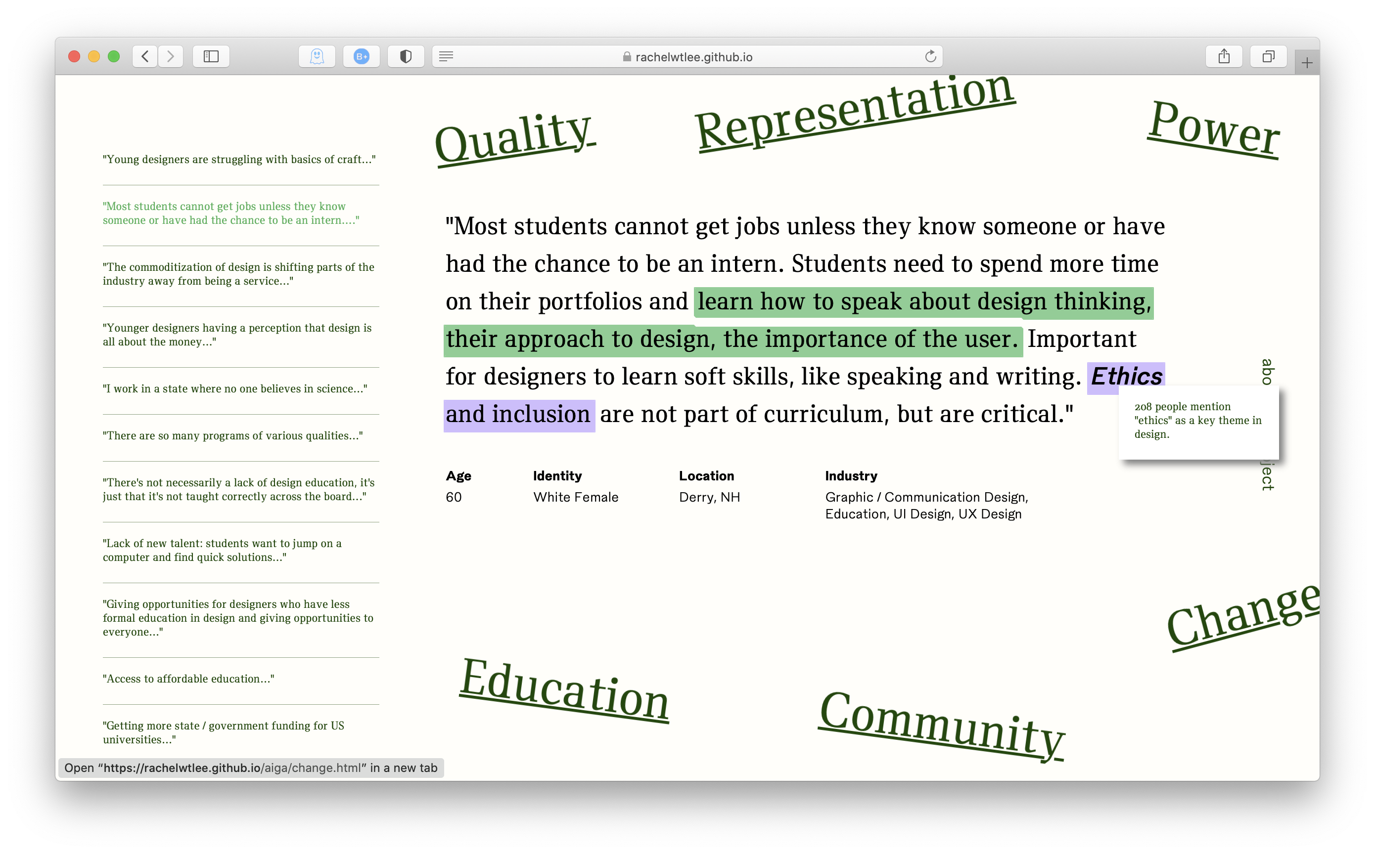
03. Spot Words
Words in bold italic are keywords that appear frequently throughout the entire corpus. Upon hover, they show stats about the frequency of use/mention.
04. External Links
We curated articles from AIGA Eye on Design, linking the concerns and critiques that designers were expressing to other commentary from the community.
Method
![]()
Reading, parsing, and analyzing many, many, many quotes
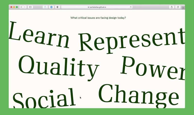
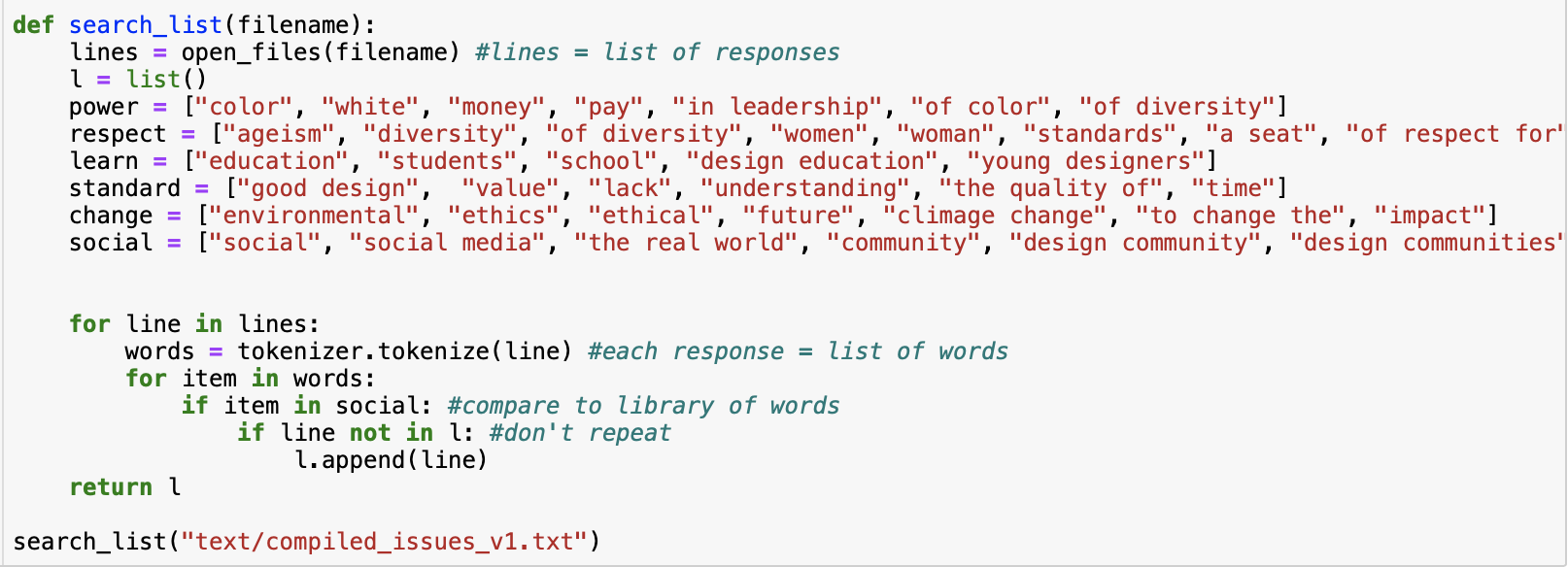
I used the Natural Language Toolkit to parse the dataset, collecting the most frequent 150 words (excluding function words like “I,” “the,” “only,” etc.) and phrases. Looking at the generated lists, we picked out words/phrases that described themes or ideas, which we grouped into six broader categories: power, representation, education, quality, change, and community. I used these groups as dictionaries to parse through the quotes again, sorting indivdual responses into categories.
This site doesn’t use every single response—it’s a prototype of a bigger collection. We selected ~20 quotes per category to analyze further, and picked phrases within the quote that described the main theme. If quotes intersected with other categories, we made sure to highlight those phrases as well. (And we had a few super sexy color-coded spreadsheets.) Jaclyn used NLTK to get stats for the frequency of different spot words on the site.
This site doesn’t use every single response—it’s a prototype of a bigger collection. We selected ~20 quotes per category to analyze further, and picked phrases within the quote that described the main theme. If quotes intersected with other categories, we made sure to highlight those phrases as well. (And we had a few super sexy color-coded spreadsheets.) Jaclyn used NLTK to get stats for the frequency of different spot words on the site.
